athenahealth Hospital Pharmacy Solution

The pharmacy and medication delivery is central to any hospital. As athenahealth started building their hospital offering we needed to create a pharmacy solution. At the outset of this project the resources available included a third party purchased pharmacy solution and access to internal pharmacy subject matter experts. We needed to understand what are the primary workflows necessary in a hospital pharmacy and what is most important to get done first. In March of 2016 I conducted site visits to observe and understand the pharmacy users and behaviors. It was determined that patient medication verification, formulary management and dispensing medications were the top three workflows in the pharmacy. While verification is the most tedious, it is the most critical to patient care and a functioning pharmacy. All verification is built on the formulary’s foundation and without dispensing the medication will never reach their intended patient.

Verification 
Conventional wisdom around the verification workflow is to work order by order starting with the highest priority order. Through site visits I observed that this causes a lot of context switching for the pharmacist. They will need to understand the order, then understand the patient’s situation and then determine if the therapy is a good match. We used this observation and opportunity to reimagine the verification workflow.

Formulary Management 
A strong formulary is the foundation of medication management in a hospital pharmacy. It controls who, what and how much licensed practitioners can order in the hospital. It’s updated frequently and needed to be a central workflow of athena’s pharmacy solution. Through observation and understanding of the users needs I designed a formulary that allowed easy set up and upkeep of the hospital medications.

Dispensing Medications 
Finally, the medications need to be prepared, documented and checked multiple times before leaving the pharmacy. This workflow is passed back and forth between pharmacist, pharmacy technician and the nurses. As a team, we focused on each user to articulate their need and the information they possess to make the transition of work easy and safe.

The pharmacy solution went from research to an in-hospital alpha in 6 months and by 9 months was live with over 30 hospitals.
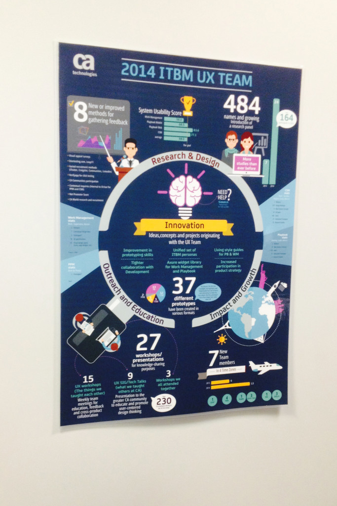
CA Technology ITBM UX Group 2014 Recap

In 2014 the UX Group accomplished some amazing things! We created a poster to advertise our accomplishments and share the good news about the UX team. I primarily lead the research activities and was able to push the bar on these accomplishments. Including the development of a research panel, product wide SUS measurements, new research methods and team education sessions.

UX Poster

Product strategy through contextual interviews

In early 2015, the ITBM group started work on a large scale research project to determine and align the product strategy for one of the flagship products. I was the lead researcher and project coordinator on this initiative. I was responsible for everything from recruitment to interviewing to analysis and strategy delivery. The product has a very large scope and user base. Through stakeholder interviews before going into the field we had identified we had identified 8 roles we wanted to target for the first iteration.

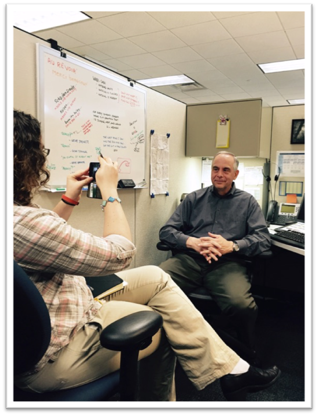
Over the course of eight weeks, we visited 17 different companies and interviewed 132 people. Working as a team, I primarily moderated the contextual interviews and my co-worker was responsible for notes.

Picture of Janna conducting and interview and taking a picture of the participant.
Myself conducting an interview and taking a picture of the participant.

Once the interviews were completed we started the analysis phase. Following a modified version of the Cooper methodology we started cataloging the insights with affinity diagraming. As we went deeper into the research we uncovered organizational variations, personas and scenarios. Our original 8 roles were expanded into 15 personas in order to cover the product ecosystem that we observed.

Notes

The insights and personas were distilled and shared with the greater product team. Using the research we guided the team to develop a new product strategy and new UI designs to better suit the user’s needs. The product strategy will culminate in a 3 to 5 year plan for the product.


Brand and Marketing Research

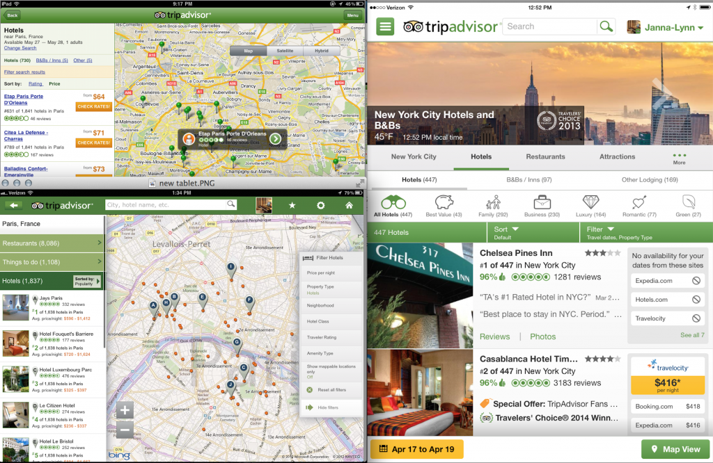
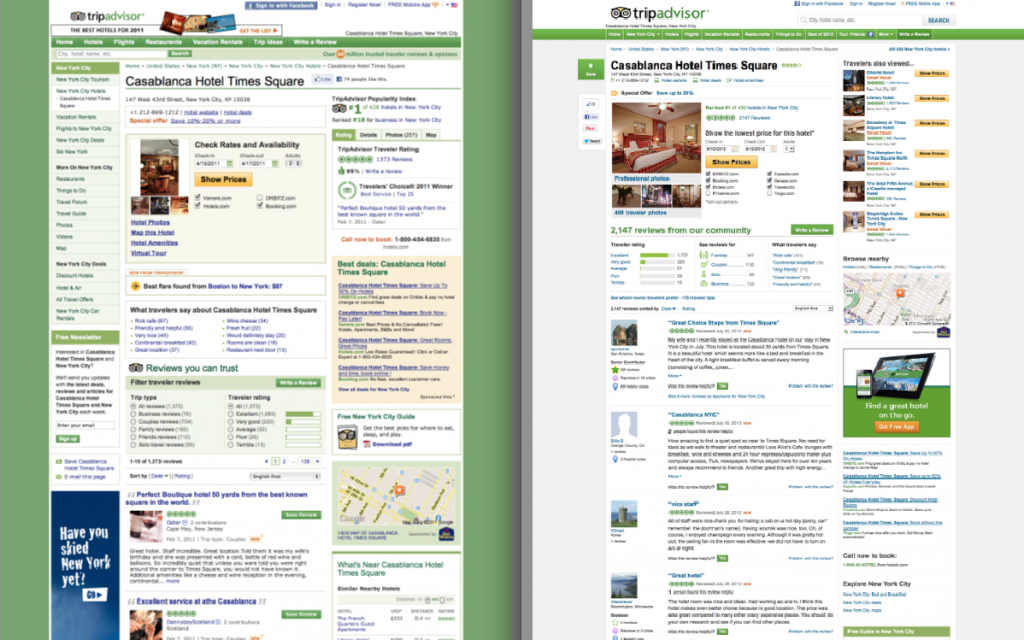
There are many initiatives at TripAdvisor, part of my work has focused on brand and marketing research. Below are some examples of work I’ve done over the years to help the brand and marketing teams outside of product research.

  • Global focus groups with users to establish our primary focus and biggest brand assets.
  • Validated the different positioning statements of TripAdvisor to determine what captured TripAdvisor and was most motivating to users.
  • Established personas for marketing and product purposes to help the teams know the difference between general traffic and core users.
  • Worked with the team to transform the brand position into many different aspects of the brand including TV ads.
  • TV Ads:
    • Early concepts of TV ad were tested repeatedly with users and non users.
    • Focus groups, IDIs and Online focus groups
    • Basic copy testing conducted in multiple countries to determine if the message was relevant and motivating.
    • Helped establish what part of the message was being communicated and how to tweak the ads to deliver better results.
  • Established a brand tracker survey that collects TripAdvisor and competitor brand awareness in 13 different countries.

Big Wins at TripAdvisor 2013

Here are some projects that I’ve worked on at TripAdvisor in 2013 that I consider big wins for user experience.

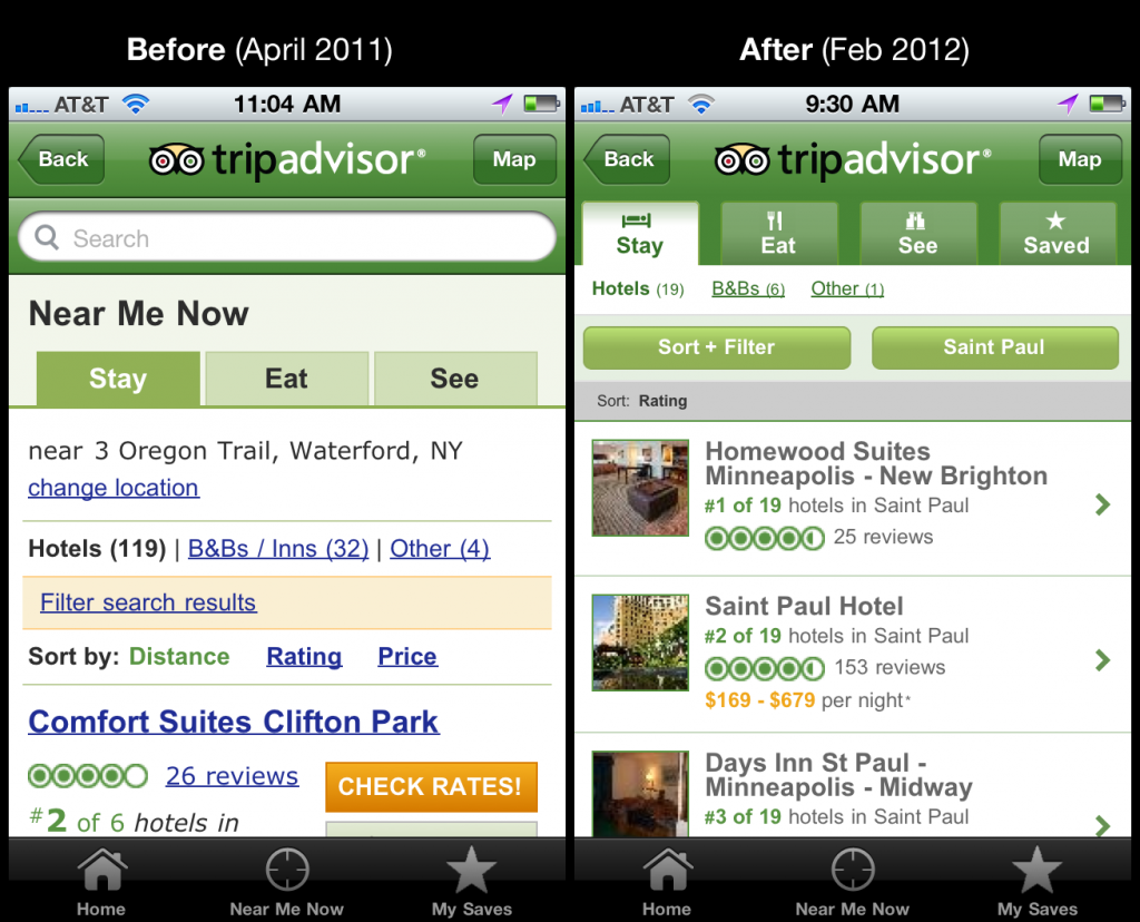
  • Reduce the number of popups/popunder on the site. (To be totally honest this was a decision made in the name of user experience and based on feedback but only carried out once the company was ready to change the revenue model and move in this direction.)
  • 4X the number of reviews being contributed to the site in non-english languages based on global focus group feedback.
  • Establish a monthly contest with employees to gather feedback on the site and encourage everyone to become users of the site.
  • Conducted multiple global surveys to understand cultural differences in travel across key markets. The results turned into personas and serve as a baseline introduction to TripAdvisor users.
  • Conducted 26+ research studies with external users to examine the usability of the site.
  • Conducted 15+ global surveys to gather insight into various topics. Conservatively fielded more than 300,000 responses.

Usability Study of the Open Audit Voting System Helios – Course Project

helios

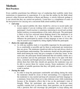
Usability Study of the Open Audit Voting System Helios (PDF)

The field of electronic voting has ventured into the area of elections that are publically auditable. A handful of open audit elections systems exist but very few of them have been critically looked at from the end user’s point of view. In our paper, we present a usability study of the web based open audit voting system Helios. By creating a mock student government election and observing the target voter’s behaviour, we have uncovered various usability issues and opinions regarding electronic voting. While the feedback was generally favourable for electronic voting, more than half of our participants would not have completed their vote. We explore the reasons behind these findings and provide a set of recommendations for the future of open audit voting systems.

Towards Enhancing Trust and Accuracy in Preference Elicitation – Course Project

PrefElic

Towards Enhancing Trust and Accuracy in Preference Elicitation (PDF)

Systems which elicit preference from users are presented with a unique set of problems based on their nature. This paper examines user trust as a possible reason why preference elicitation systems are met with resistance from users. With the example of a personalized news recommendation system in mind, we examine ideas control, understanding and personalization. We make recommendations for improvement to this system and the subsequent study that should see increased improvement in user satisfaction and system accuracy. The underlying goal is that increasing the user’s trust in the system, which will in turn increase the accuracy of preference elicitation.

MyUWindsor Student Portal – Usability Study

portal2

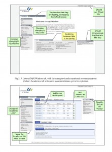
Usability Study of the Campus Student Portal (PDF)

This system was designed to be a central location for all students, prospective students and alumni to find information relating to their school activities. This is the second part of a two part study to determine the initial usability of the portal system. This study interviewed 12 participants randomly selected and asked them to perform basic tasks with the new website to determine the discoverability of the new features.

MyUWindsor Student Portal – Heuristic Evaluation

portal1

Heuristic Evaluation of the Campus Student Portal (PDF)

This system was designed to be a central location for all students, prospective students and alumni to find information relating to their school activities. This is the first of a two part study in which I initially performed heuristic evaluation of the student portal to determine what the major tasks and problem areas were before performing a more formal usability study. A number of recommendations came out of this review.

Cultures of Health Website – Heuristic / Lab Study

culturesHealth

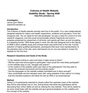
Cultures of Health Website Study (PDF)

Spring of 2008 I was contracted to perform a usability study of the Cultures of Health website, a research group at the University of Windsor. I performed a brief heuristic evaluation of the website as well as a lab usability study with 6 highly targeted participants. While the participants understood the concept behind the website fairly well most unsure how they would continually use it. This was frustrating because one of the goals of the website was to create a community and harvest the energy of user generated content. Some of the recommendations lead towards fixing this goal.